Skills
Art Direction, Illustration, Layout
Timeline
12 weeks
Tools Used
Illustrator, InDesign, Photoshop
CHALLENGE
Working closely with the owner, we worked to establish a brand that represented Chomp's fresh and somewhat aclectic take on the standard burrito and also stayed true to her and her partner's fun, imaginative style. Chomp's burrito's riff on international flavors, as well as incorporating classically American foods that one does not typically find in burrito form (for instance "The Mash" which has cheesy mashed potatoes inside. It is delicious). Visually representing this fresh, audacious approach to mixing culinary traditions in burrito form was a great and engaging challenge.
GOAL
The goal was to create a brand that alluded to the Chomp's culinary mixing of waters and was as colorful, bold and bright as the product and its owners.
SOLUTION
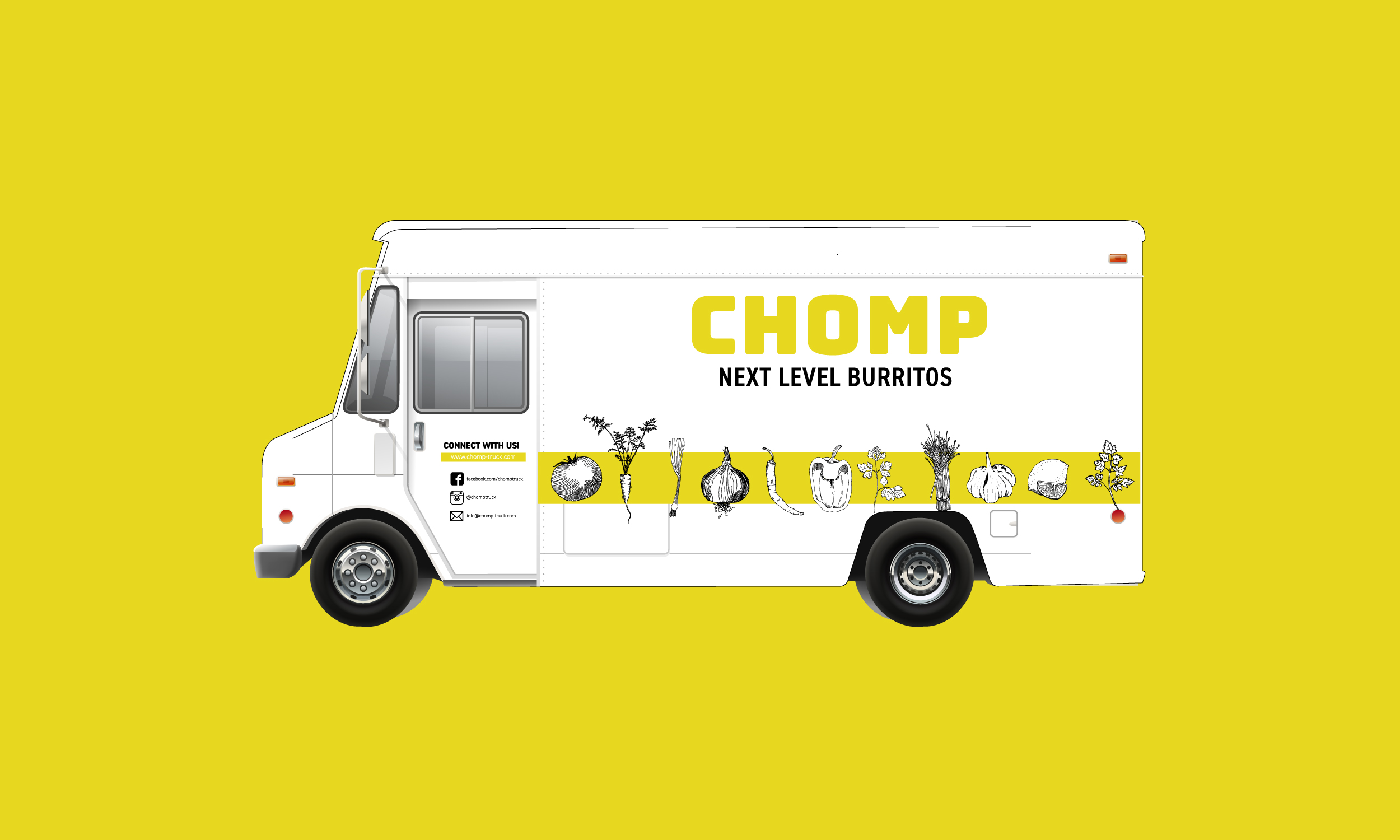
I decided to represent Chomp's dynamism by mixing elegant, traditional 19th century engraving inspired line drawings with a eye catching mustard and modern bold type. The combination of the line drawings and the attention grabbing color and bold san serif give a strong impression that Chomp pushing the boundaries and mixing it up.
PROCESS
Working with the owner, we selected and refined my illustrations to suit the menu and the look and feel of the product. Chomp is invested in featuring ingredients from local sources so we worked to have the food illustrations be elegant and appealing, in part to pay tribute to the quality of the ingredients. In selecting a typeface for the menu, I chose Din for its boldness, its somewhat industrial stark lines, but also for how it complements the finer line quality of the illustrations. Working on this juxtaposition I selected the mustard which I felt was a good indicator of the lively, a-typical nature of Chomp. I felt it married the modern type with the delicatacy of the line drawings.


